Streamlining a flow
This two-screen user flow looks simple enough — but getting there took lots of work. After whittling down requests from stakeholders, we were left with just the essentials.

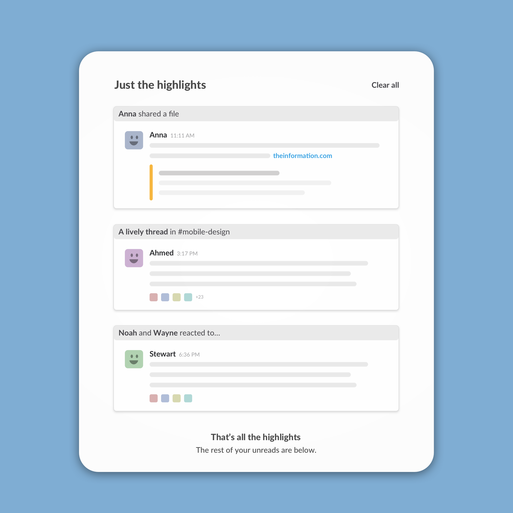
Explaining an algorithm
We applied machine-learning smarts to surface important unread messages. Giving some insight into why a particular message made the cut helped build trust with skeptical users.

Teaching in context
Again and again, user research has taught us that in-context education is stickier than traditional onboarding. Here I managed to sneak a little explanation into the button itself.
1
2
3
Previous
Next


